Color of the Year 2026: A New Era of Grounded Elegance
Experts reveal their top shades for 2026, and they’re all about balance — grounded neutrals, elegant depth, and nature-inspired calmness redefine how we color our homes.
If the past few years were all about playful optimism and nature-inspired calm, 2026 brings a new kind of balance — one that’s deeper, more sophisticated, and quietly confident. The top color predictions from leading paint brands share a collective theme: comfort through refinement. Earthy undertones, smoky greens, and tailored neutrals create a timeless palette that feels modern yet enduring.
Let’s explore what color experts from Benjamin Moore, Sherwin-Williams, Pantone, Valspar, and Behr envision for the coming year — and how these hues will shape interiors around the world.
Benjamin Moore: Silhouette
Benjamin Moore’s Silhouette embodies quiet luxury and classic refinement. Inspired by the elegance of tailored suiting, this hue blends espresso brown with soft charcoal undertones, creating a sense of depth and warmth. It’s a color that evokes both strength and subtlety — perfect for moody living rooms, statement kitchens, or serene bedrooms layered with texture.
Images courtesy of Benjamin Moore
Paired with crisp whites or brushed metallics, Silhouette creates interiors that feel confidently composed — a refined backdrop for modern living.
Stuck on your next design move?
Let AI generate stunning layouts in seconds.
Sherwin-Williams: Universal Khaki
For Sherwin-Williams, the future of design lies in the return of earthy neutrals. Their 2026 Color of the Year, Universal Khaki, celebrates a shift from cool grays to sandy, sun-warmed tones. This versatile khaki provides the perfect foundation for both minimalist and bohemian styles, effortlessly grounding a room without overpowering it.
Images courtesy of Sherwin-Williams
Whether used on walls, cabinetry, or textiles, Universal Khaki balances natural light beautifully — a shade that adapts, connects, and comforts. As Sherwin-Williams notes, it’s a reminder that simplicity can be profoundly chic.
Pantone: Cloud Dancer
Pantone’s Color of the Year 2026, Cloud Dancer, brings a soft sense of calm to an increasingly loud world. This airy white feels peaceful and open, inviting you to slow down, refocus, and let ideas flow. Its versatility makes it a natural anchor shade—light enough to lift a palette, yet strong enough to let other colors stand out.
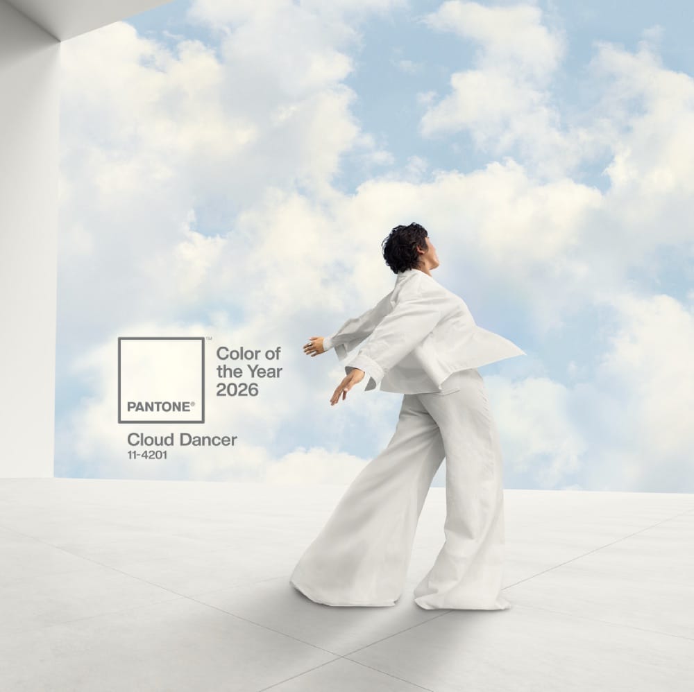
Image courtesy of Pantone
Whether used on its own or paired with gentle pastels and muted neutrals, Cloud Dancer creates easy, understated contrasts. It slips effortlessly into any environment or product design, offering a clean, quiet backdrop that supports creativity and personal expression.
Valspar: Warm Eucalyptus
Warm Eucalyptus by Valspar captures the essence of mindful living. A gentle, green-infused neutral, it bridges the gap between nature and nurture — restorative, serene, and grounding. This color invites us to slow down and find peace in our surroundings, aligning perfectly with the ongoing trend toward biophilic design.
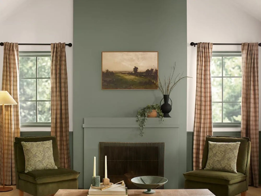
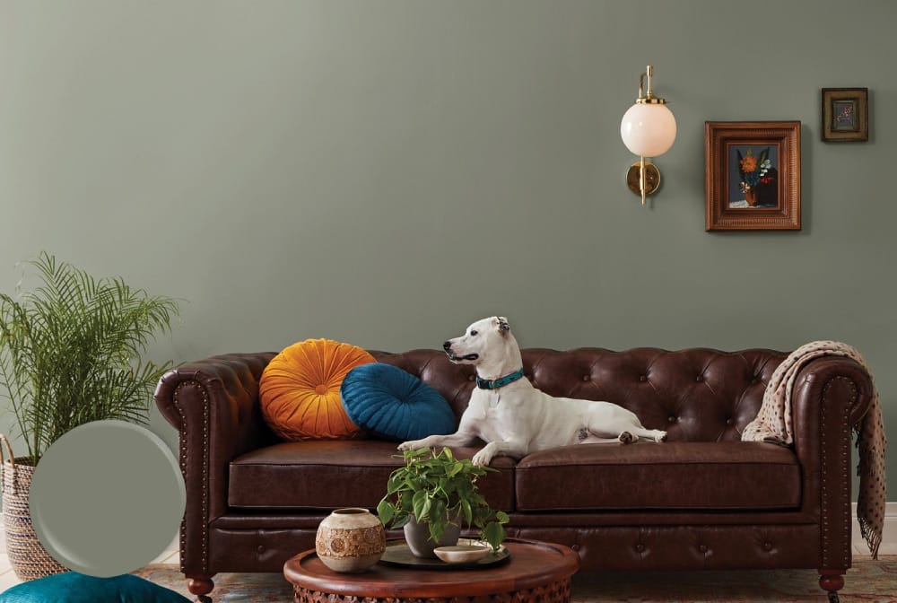
Image courtesy of Valspar
Valspar describes it as “color that’s restful to the eye and restful to the soul.” In practice, Warm Eucalyptus pairs beautifully with natural textures like rattan, linen, and pale wood, turning every space into a soothing retreat.
Design smarter, not harder.
AI suggestions tailored to your space and style.
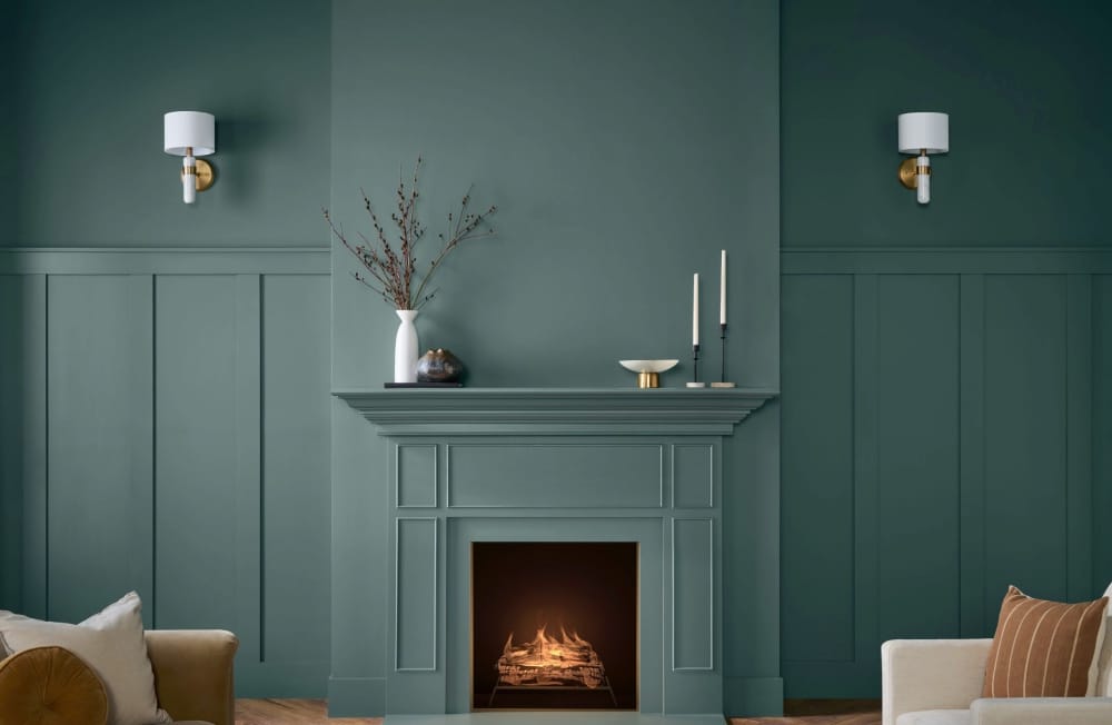
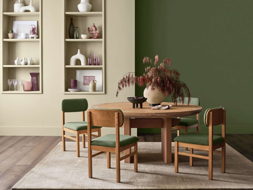
Behr: Hidden Gem
Behr’s Hidden Gem introduces mystery to the palette. A smoky jade with rich depth, it evokes sophistication and self-expression. Somewhere between green and gray, this hue is both calming and bold — ideal for creating spaces that feel luxurious yet grounded.
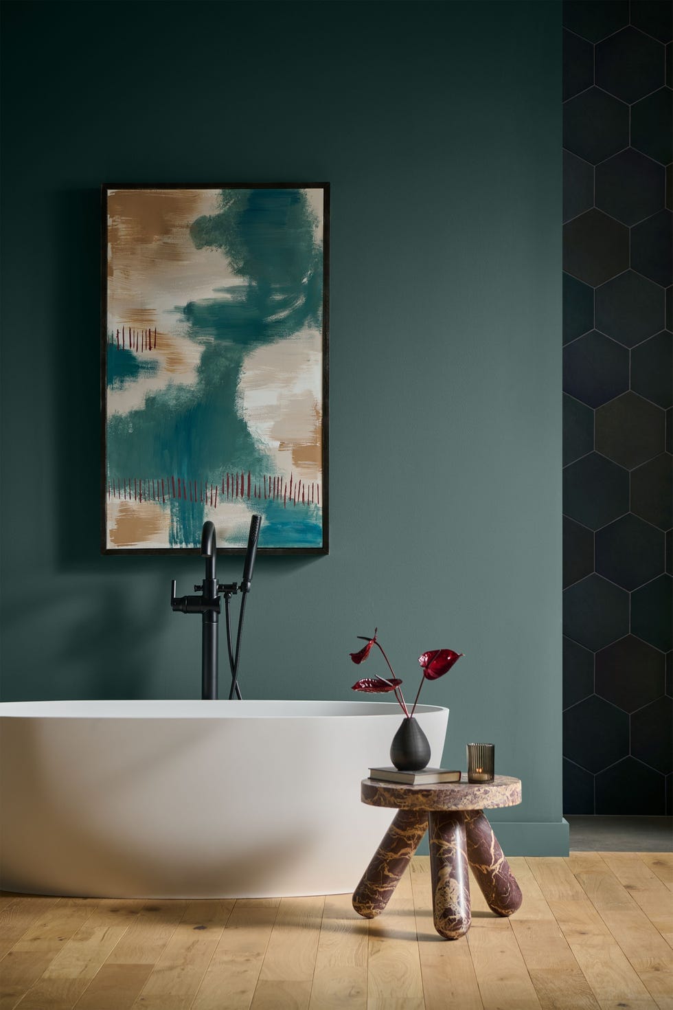
Image courtesy of Behr
Hidden Gem works effortlessly in accent walls, bathrooms, or cozy study nooks. It invites the eye to explore, revealing new subtleties in different light. For 2026, it’s the color of introspection — elegant, layered, and quietly captivating.
A palette that reflects the moment
Across the board, 2026’s colors speak to a collective desire for stability, connection, and meaning. The palette leans into warmth and texture — espresso browns, sunlit khakis, organic greens, and shadowed jades — all tones that celebrate natural beauty and the power of subtle design.
Whether you’re refreshing a single room or planning an entire home redesign, these shades remind us that true color harmony isn’t about standing out — it’s about feeling at home.
Planner 5D: The Future of Interior Design
Experience the power of AI-driven design with Planner 5D. Our innovative tools, including the Design Generator, Smart Wizard, and AI floor plan recognition, make bringing your dream home to life easier than ever. Transform your vision into reality and unlock a world of design possibilities today.
Start designing your dream home