2023 Color of the Year According to Color Experts
The 2023 Color of the Year picks from paint experts are here.
The end of the year means it’s all about predicting what will be hot and happening next year. When it comes to paint colors, the same applies. Today, we are looking at the color predictions by the biggest names in the paint industry. If you’re wondering what color you should repaint your living room or bedroom in 2023, then this post is for you.
What's in this post:
How the Color of the Year is chosen
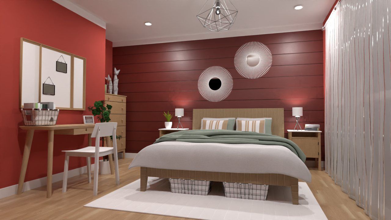
Raspberry Blush by Benjamin Moore
How the Color of the Year is chosen
Choosing the Color of the Year is serious business. Each year, a group of carefully selected color and design experts gathers to choose next year’s pick. They look at inspiration in art, home design, furniture, fashion, culture and environment and base their selection on common threads in these disciplines. Once chosen, these colors become an inspiration for everything from paint color to furniture and clothes.

Does this mean you should change the colors of your walls? The answer is no, you don’t. However, if you’re looking for new ideas and want something fresh and modern, then the Color of the Year can be your inspiration. A selection of complementary color palettes accompanies the chosen color, allowing you to try them in different color combinations.
Raspberry Blush by Benjamin Moore
Benjamin Moore’s pick for color of the year is a bright, energetic, bold color guaranteed to add personality to any room. Raspberry Blush is a deeply saturated color with a tint of pink, red and orange bound to offer plenty of inspiration. The 2023 color trend palette includes saturated colors chosen for their “distinct presence and personality.”


Raspberry Blush by Benjamin Moore
Benjamin Moore’s color selection is based on the trend of people moving away from neutrals and embracing vibrant and saturated hues in their homes. This palette is an excellent choice for people who love to play around with color and try new, bold color combinations that add vibrancy to their spaces. If you’re not ready to fully jump into these colors, the company also included a selection of neutrals that coordinate with the selected colors as well as any others.
Redend Point by Sherwin Williams
Sherwin Willams color of the year is a warm, blush-beige neutral that is all about embracing a connection with nature. Redend Point was chosen for its easy connection to all spaces and for invoking compassion and joy while inspiring us to look at the beauty around us. It is a subtle, calming color with a coordinating palette of warm, earthy colors.


Redend Point | Photo courtesy of Sherwin Williams
The palette is ideal for creating cozy, comfortable and inviting spaces in any home. It also includes many warm, desaturated colors that lean toward reds, oranges and pink with gray undertones. This color combination is perfect for people who love neutrals and want to add more colors to their space without them being overly saturated.
Blank Canvass by Behr
Behr’s Color of the Year is a warm neutral that can update any room in your house. Blank Canvass is a warm, timeless and versatile neutral with a modern organic feel that works with any design and style. Best of all, this color looks great on everything from your walls to furniture.
Blank Canvass by Behr
The complementary color palette can be described as a combination of neutrals and accent colors that evoke serenity and peace. All of them lean towards warmer hues, which can be incorporated into every lifestyle choice. This color combination is ideal for those that love clean designs and classic neutral palettes.
Viva Magenta by Pantone
Pantone’s Color of the Year is a bold and vibrant hue that makes a statement. Viva Magenta conveys passion, inspires optimism, and will make any room stand out and give it character. The color is a bold crimson red with pink and purple undertones that perfectly balances warm and cool tones. It’s a hybrid color that easily transcends the digital and physical spheres.


Viva Magenta by Pantone | Images Shutterstock
Viva Magenta is about self-expression, courage, confidence and unleashing your inner fire. It’s a perfect statement for expressing a rebellious spirit and creativity. However, if you’re not ready to commit to Viva Magenta on all your walls but would like to incorporate it into your home, opt for pillows, accessories, carpets or chairs in this color.
Conclusion
Based on the color and design trends coming our way, 2023 is shaping up as a year of self-expression and stimulating colors. We’ll see a departure from stark whites and grays and expect lots of warm neutrals and earthy, more saturated colors. Pastels, pink-infused tones and bright, punchy colors are a departure from the soothing color palettes and coziness of the previous years.
So, whether you’re looking to give your home a complete makeover or a minor refresh, these color trends will dominate everything from paint and furniture to accessories and fabrics. It’s the perfect time to start planning your home project. Try out the Planner 5D editor and see how your house will look before you even pick up a paintbrush. Happy decorating!