Color Psychology: Best Hues for Every Room
Did you know that colors can affect how we feel? Here is the 411 on the most popular colors in interior design.
In interior design, personality and taste come together as one. Every design starts like a blank canvas and evolves as color is added. The color choices used in paint, furniture, decor and other design elements transform a room from an empty shell into a well-designed space. While color often serves an aesthetic purpose, it goes a lot deeper than that.
Color is a very personal choice, so how you choose the perfect color for your home depends on what you want to achieve. Let's look at how colors affect your feelings and can influence your mood to guide you on using them correctly.
Color breakdown in interior design
What is color? It's the way our eyes and brains perceive different waves of light. Colors exist on a spectrum, and while we can "perceive" many of them, the specific number is unknown and, technically, endless.
Here is a run-through of the most common colors on the spectrum. Many of these can be combined to make others, or through color mixing, can be used to create several different shades. This post briefly describes how these colors are perceived psychologically and how you could use them. While each person perceives colors individually, the consensus on specific colors is strikingly accurate.
Green
Green is the color of nature. It's a bright shade that evokes a sense of balance and growth. It makes us think of the outdoors and offers a sense of renewal and peace. Green simultaneously relaxes and invigorates, making it a perfect choice for rooms where you want to feel positive and focused.
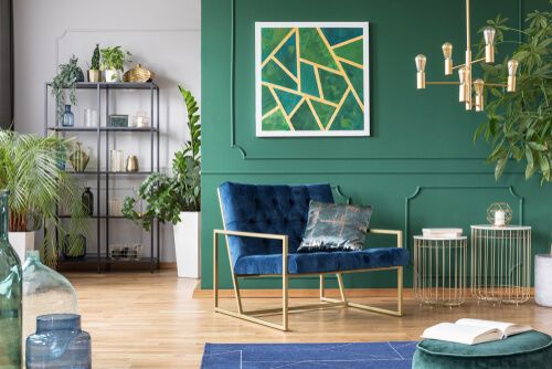
There are many shades of green, from olive, avocado and grass to deep jeweled tones and deep greens. The deeper and darker the shade, the more indulgent it comes across. Pick one that reflects what you want the color to accomplish.
Yellow
Yellow is a joyful and energetic color. It's vibrant and playful, and much like the sun, it's full of brightness and optimism. From lemons to sunflowers, yellow is often found in nature and can be uplifting. Too much of it, however, can overstimulate, so use it sparingly.
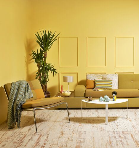
Yellow is close to gold, often associated with luxury and prosperity. If you're not quite ready to introduce yellow into your home, consider adding gold elements instead.
Red
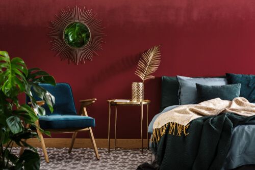
Red is a daring and dramatic color that often stimulates passion and excitement. At its core, it's a powerful hue that can be rich and beautiful. If used correctly, it can add nice depth to any area in the home. The ambitious undertones in red make it perfect for productive spaces such as offices and studios. Red is also one of the elements behind feng shui, representing fire. It can add vibrancy and movement to any room, even when used in accessories.
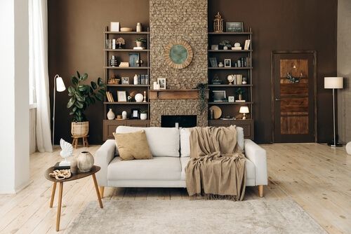
Brown
Brown is another color that represents nature. It's relaxing and comforting, making it a perfect choice for any home. It works well as an accent color and as a neutral one. You can incorporate brown in every room aspect, from wall colors to floors and furniture. Brown works well with natural materials like wood, stone and metal.
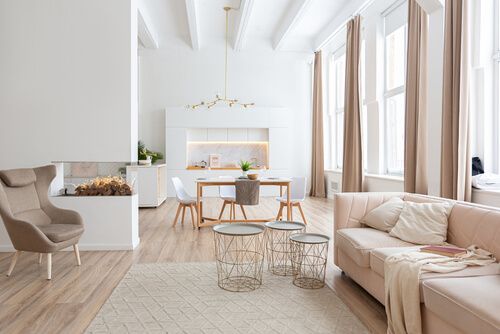
White
White is a great color choice for spaces you want to appear larger. While it's a neutral color, you can use it to create bright, spacious and relaxing places. There are also many shades of white, ranging from cooler to warmer undertones, making white a versatile color that can be used with every other color.
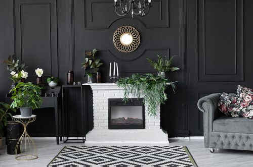
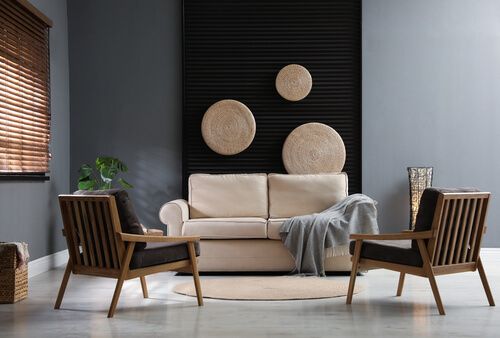
Black
Black is a classic color for a reason. Much like in fashion, black goes well with everything. Its neutrality is its strongest asset. It's powerful, dramatic and mysterious that works well in a monochromatic color scheme. You can use it as an accent or add depth to any room.
Grey
Like black, grey is a versatile color that can provoke many emotions. Its calming tones, range of shades and neutral composition have made grey one of the most popular colors in interior design over the last few years. Gray creates a sense of security and intelligence, making it an ideal choice for family homes. How you use it matters as, depending on the hue, it can be delicate and soothing or bold and dominant.
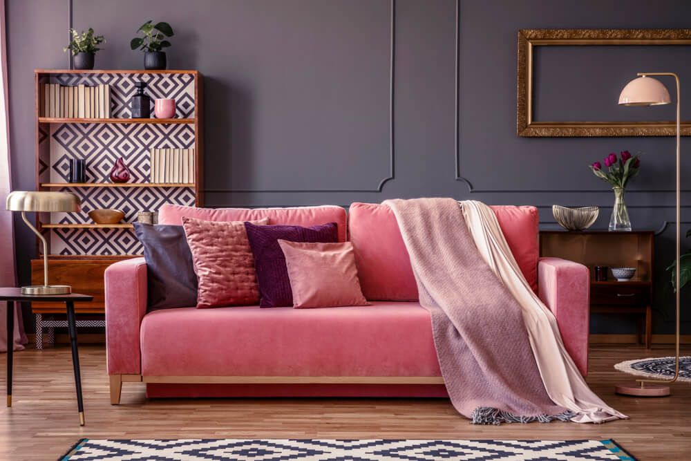
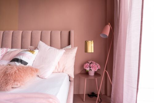
Pink
Underused in general home decor while overused in little girls' rooms, pink is a soft, nurturing color. It can be vibrant or muted, depending on the atmosphere you want to create. Pink doesn't have to be girly to appeal in interior design. It's a color that can be used to create sophisticated and luxurious spaces that are also classy and masculine.
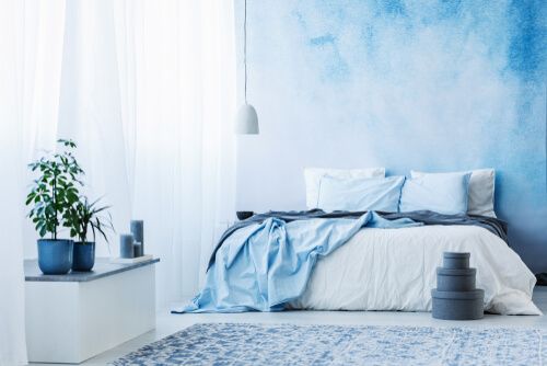
Blue
Blue is a versatile color that you can use to create a serene atmosphere or to make a statement. It's a color associated with calmness, serenity and relaxation that can improve your mind and body. Blue comes in various shades, from baby blue to navy, making it a great combination color that can be used with others in almost every room in your home.
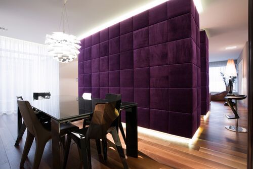
Purple
Purple is a color often associated with wealth and creativity. It is a luxurious color that can create a presence and leave a great impression. Like pink, it has feminine undertones that are more prominent in the lighter shade of the color. However, the darker hues of purple can also be very masculine, with lots of depth and richness.
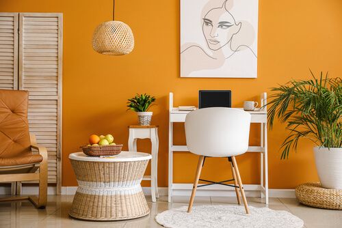
Orange
Orange is another excellent statement color that can add energy to any room. Much like red and yellow, it's a happy color that can be both subtle and bold. It goes well with neutrals like white, black or brown. Decorating with orange is a great option if you want to create cheerful, earthy vibes or a more dramatic atmosphere.
Using colors in interior design
Every person has an individual reaction to color. While some might find white boring and bland, others love it for its cleanliness and simplicity. Some people might hate the brightness of yellow, while others may find it refreshing and energetic. What works for one person might not work for another.
The trick is understanding what you want from the space and finding a color combination that best reflects that. Here is a run-through of various ways to use color in different spaces. This will allow you to make an informed decision on using color in your space!
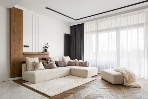
Living room
Green, with its versatility, is the most restful color for the eyes and creates a sense of calm and security. You can use it for entire rooms by contrasting various shades to create a nice, harmonious depth. The great thing about green is that you can add this through plants and shrubs placed in a room with a lighter background.
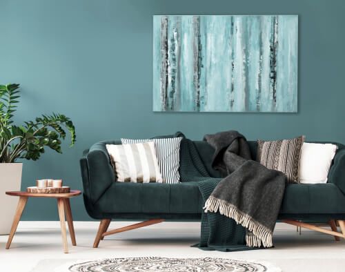
Purple is dramatic and rich and adds great depth to any design. It can be used as an accent in the room or to make a bold statement. It's sophisticated and luxurious and would work well in a living area you'd love to show off to guests.
Brown is a reassuring and warm color that, when used correctly, can make people feel welcome and comfortable. It works well for creating a rustic look and is best used alongside colors that provide a positive effect, as brown can also be a bit somber.
Kitchen
Red increases appetite, and its intensity can excite, mostly at night. It stimulates conversation, so it could be a great choice if you are the type of person to have people over for dinner. In turn, pink can be used for a dining room as it can add glamour and comfort.
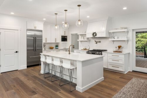
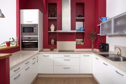
White is a classic choice for any kitchen and can make your space appear larger and brighter. It also produces a calming effect which can help ease any pressure while cooking. Orange can work in a kitchen because, like red, it can help stimulate the appetite.
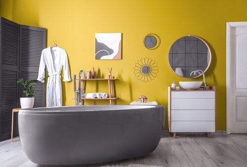
Bathroom
Yellow is a cheerful and energetic color that can be a great addition to any bathroom. It is fresh and uplifting but should be used cautiously, as choosing the wrong shade can have the opposite impact.
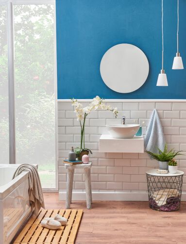
Blue can be an excellent choice for a bathroom as lighter shades can have a healing effect on the mind. It creates an image of the sea or bodies of water and can relax you and slow down your heart rate.
Bathrooms are often small, making white a great color option. Because of its simplistic and clean vibe, it is commonly used for bathrooms to give a sense of space and cleanliness.
Bedrooms
Pink can create a feel-good atmosphere and is the obvious choice for a girly room. Royal blue or any other blue shade is commonly used for a boys' bedroom. However, you can use it in any bedroom as blue has a calming effect and is easy on the eyes, which in turn, helps ease any discomfort.

Similarly, green is a great choice for a bedroom because of its calm and soothing nature. White and off-white neutrals are also perfect options for relaxation and well-being.
Office space
Blue has a calming effect and significant benefits to the mind and body, including slowing down the metabolism. Certain shades can represent knowledge and power and are a great addition to any home or office.
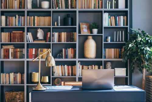
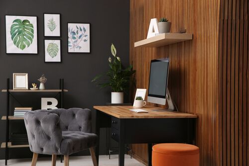
Black signifies simplicity and functionality. It is a versatile color that can be used in virtually any space. It is modern and elegant and would look fantastic in an office space. Contrast it with light furniture or modern accents for a stunning visual.
Entrance
If your entryway is small and dark, opt for light colors like white to add brightness and light. Yellow can be welcoming in hallways and foyers, but it's best to use it sparingly. Purple can also work great in an entrance, as its elegance and depth create a calming and welcoming effect.
Conclusion
While the psychology of colors is a massive area of study, the implications of its use in interior design are obvious. Understanding color psychology is essential for any designer - professional or amateur- to understand how to best utilize color in their designs.
We hope this post has helped you understand how colors affect our moods and how to use them to create effective color combinations that work for you and your clients. Happy decorating!