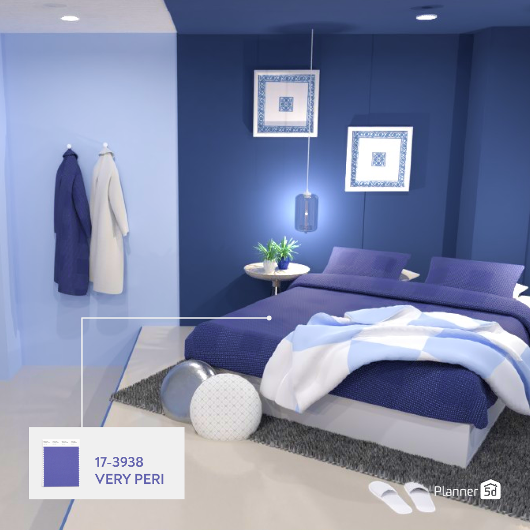
Pantone Colour of the Year 2022: Very Peri
The color experts at Pantone reveal the 2022 Color of the Year - Very Peri. Here is what you need to know about this color shade and how to incorporate it into your decor.
It's that time of the year again and we are super excited. Every year the experts on colour, Pantone, reveal the shade that will be at the forefront in the coming year. Aptly titled Pantone Colour of the Year, this year they have chosen Very Peri as the colour of 2022.
According to Pantone, Very Peri encompasses the qualities of blues while also possessing violet.red undertones.
PANTONE 17-3938 Very Peri displays a spritely, joyous attitude and dynamic presence that encourages courageous creativity and imaginative expression.
Want to know how Pantone chooses the colour every year? They explain to us in their own words.
The Pantone Colour of the Year selection process requires thoughtful consideration and trend analysis. To arrive at the selection each year, Pantone’s colour experts at the Pantone Colour Institute™ comb the world looking for new colour influences.
They go on to explain that these influences can come from places such as the entertainment industry and film productions, as well as other areas such as travel, art, artists. fashion, all areas of design and also lifestyles and playstyles. Pantone explains how their influences are very diverse and wide and may also include new technology, materials, textures and effects that impact colour.
The Colour Institute itself is part of the business unit within the company that highlights and selects the colour each year and has done so for the last 23 years. In doing so they have influenced everything from "product development and purchasing decisions in multiple industries, including fashion, home furnishings, and industrial design, as well as product packaging and graphic design." While choosing the colour they utilise season trend forecasts and, as always, rely on the psychology of colours to make their decision.
Pantone's Colour of the Year tends to impact interior design trends for the upcoming year in which it is announced and this year is set to be no different. Why this shade you ask? Well, Pantone states that it chose this colour as a way to remind people to "embrace the altered landscape of possibilities, opening us up to a new vision as we rewrite our lives."
Executive Director of Pantone Colour Institute, Leatrice Eiseman, has a lot to say about Very Peri. She explains how Very Peri brings a sense of trust that comes from a beloved member of the blue colour family. She goes on to speak highly of the colour and tells us how it has a "joyous attitude and dynamic presence" that is bound to provoke creativity, imagination and expression in the year to come.
When it comes to how this colour will influence design this year it's very clear based on numerous factors. Primarily, we can see how due to various reasons, people worldwide are continually searching for ways to relax as well as embrace self-love and self-care, and many times this is usually reflected in the design. People are always wanting to implement calm into their homes and a lot of the time colour is a great way to do so. With Very Peri and its cool and soothing blue tones, we can see how this will be put to good use in helping people add calmness and relaxation to their interiors, however with the subtle redness they will also benefit from a hint of energy.
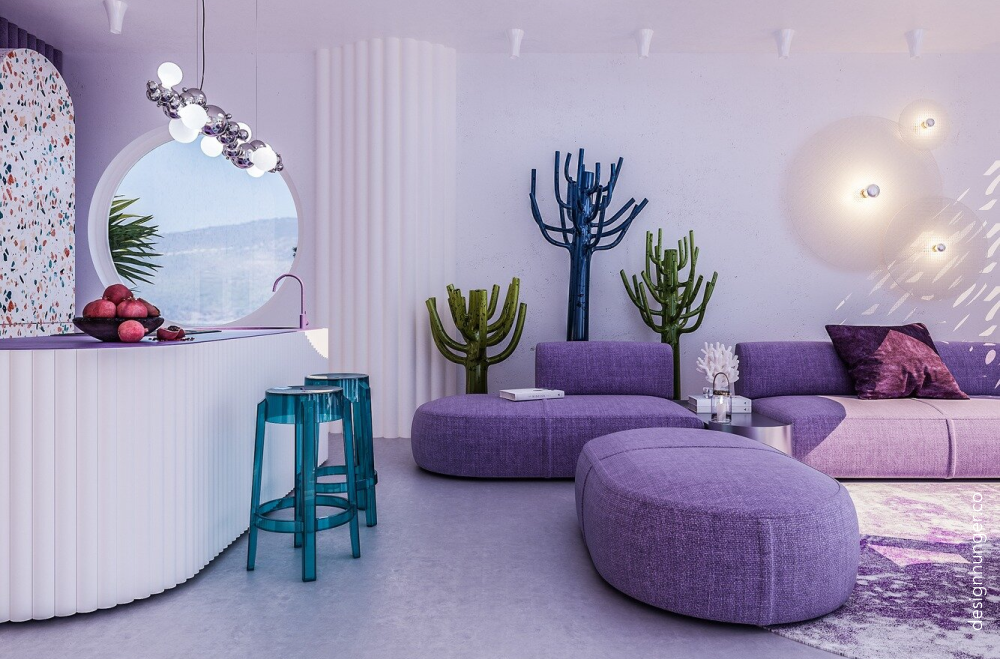
With the announcement of this year's colour, experts are predicting a refresh in our homes in terms of playfulness. By this, they interpret that this can be in the form of colour experimentation and interesting combinations, bold colours and statement pieces, as well as everything and anything you can and will imagine.
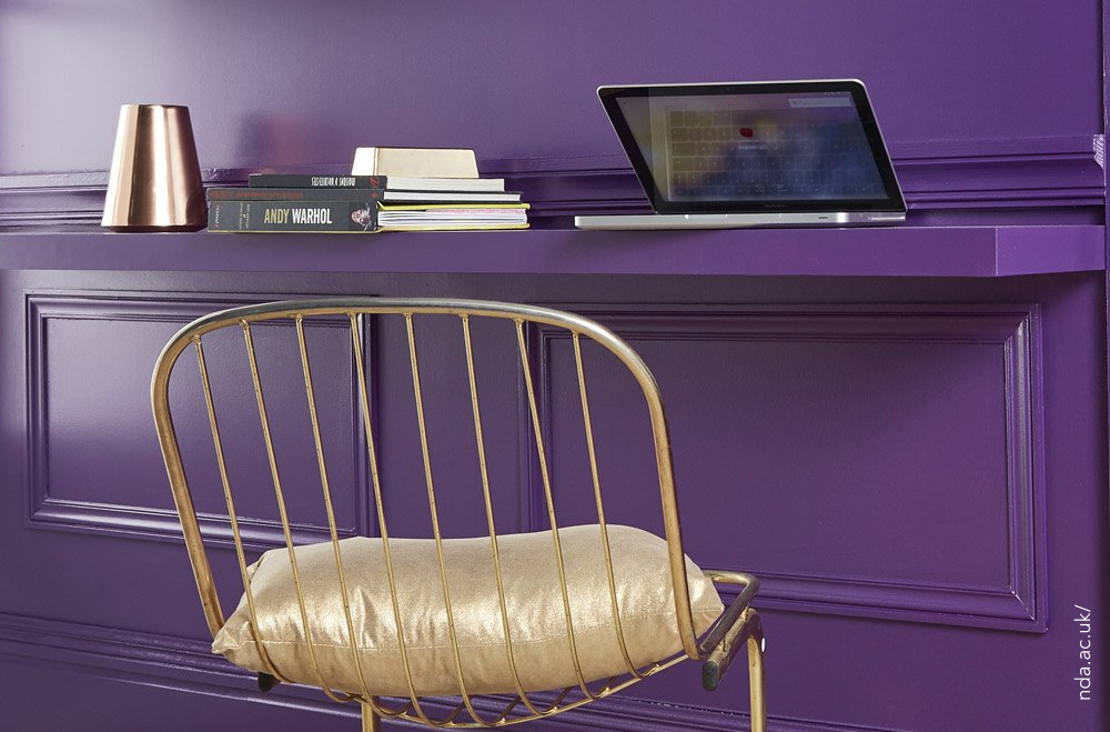
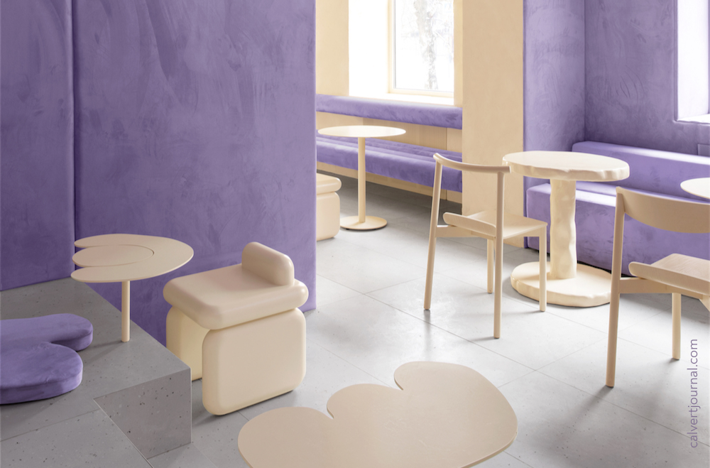
The great thing about this colour is that it can be utilised in a number of different ways, from materials to paints, wallpapers to textiles and everything in between. Very Peri will add an exciting pop of colour to any interior as it is definitely eye-catching in any way that it is used.
Very Peri is an interesting hue, with the blue and red combinations it's a calming and grounded tone but also exciting. This type of colour is great as a stand-alone shade or would also work in a combination, it's up to you how you use it, so get creative and get inspired.
In the past when Pantone has announced their Colours of the Year these shades dominated the interior design world and of course we expect this year to be no different. We suggest you follow the advice of Pantone themselves and get creative and imaginative, and try to add Very Peri to your home!