103
Designer’s notes
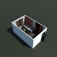
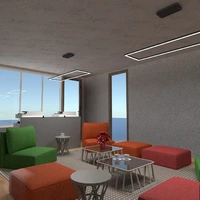
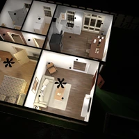
please like it!
Comments (15)
Tony Hawk
this is good
2020-11-09 16:38:36

zaid
VERY COOL HUZAIFAH
2020-11-09 16:38:59

Tony Hawk
it just looks a bit small
2020-11-09 16:40:29

Tony Hawk
...
2020-11-09 16:41:15
Huzaifah Al-Quraishi
yea!
2020-11-09 16:41:38

Huzaifah Al-Quraishi
The gold lighting looks good!
2020-11-09 16:41:53

Tony Hawk
and try using something other than white
2020-11-09 16:42:42

Huzaifah Al-Quraishi
no the rules were to use white!
2020-11-09 16:43:58

Huzaifah Al-Quraishi
the rules were white and brown but i didnt do brown cuz it would look ugly! thats why i did white and gray ad light blue walls!
2020-11-09 16:44:31

Huzaifah Al-Quraishi
gray walls*
2020-11-09 16:44:42
Abdullah Chughtai
good job
2020-11-09 16:50:57

Huzaifah Al-Quraishi
yea
2020-11-09 16:51:40

Tony Hawk
hbtsufzlishgdbxhjbvv
2020-11-10 18:05:28

Huzaifah Al-Quraishi
shhh!
2020-11-10 21:37:33

Tony Hawk
herush gnwhgneihg wgekgbjbd
2020-11-12 17:35:31

{comment}
{createdAt}

