评论 (20)
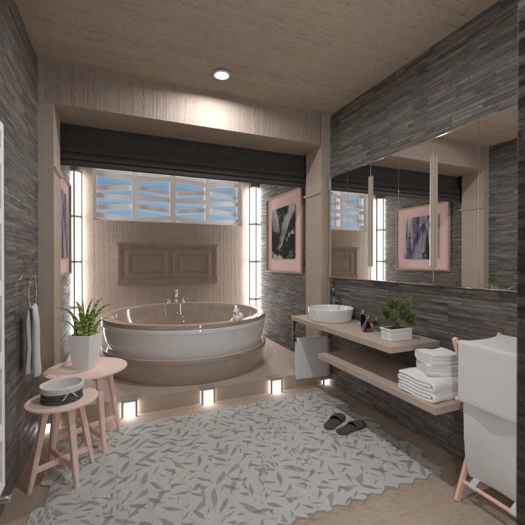
Hi, I just wanted to share these tips, just in case I've thought of design choices you haven't yet considered... 1. During voting, the rendered image is fixed from the perspective of the doorway. If you have things in the way (furniture/partitions) the area behind them will not be visible. 2. Lighting choices can make a HUGE difference to your final render. I've seen some beautiful designs in the last contest, but because they used darker colours, in combination with curtains/blinds, they blocked natural light and the resulting render was very very dark. 3. Lighting choices (continued). Changing the colour of your lights, accents or walls, is a great way of balancing the temperature and/or tone of your colour choices. A light might just make something pop, or even remove emphasis on something that could distract from your focal point. 4. Editing is KING! Before you go ahead and publish your design, if you have time you could make a copy, otherwise use the original, and do a brutal final edit. What I mean
2021-03-01 12:57:24I'm actually regretting not following through with my walk in shower/bath combo. thing is, I didn't think anyone would really understand what it was supposed to be given the tools we were given to work with. Maybe next time!?
2021-03-01 13:00:40Sorry about the massive paragraph, I did use double line breaks!?
2021-03-01 13:01:26According to your renders there is a lot of darkness, with a bit of pop of color. They are also very modern. With that being said, in my opinion, it does not meet the challenge. There is a lot of beige accents, but maybe a pastel green/ blue would be better considering everything. There is a lot of architectural elements, that is modern. Inside, the wallpaper is great but maybe a brick one? Where the tub is located, I think you can try to make a pastel effort. I love how everything inside looks, but it does not exactly meet the challenge. I do have a question, why is there a tub outside and on top of the design? Was that intentional? Overall I love this design and you have a great modern style, but it's not that pastel. Please check out my designs, makes sure to comment! Great job!
2021-03-01 17:11:15Wow *o* es un diseño muy hermoso y creativo.
2021-03-01 17:11:36This is one of my longest comments! Disclaimer: I am not here to bash your work because I really like it. In my opinion, it does not meet the challenge.
2021-03-01 17:12:30I am sorry for commenting and blasting your notification center for the third time, but I just wanted to say I really appreciate the tips. I will take those into a note for future reference.
2021-03-01 17:17:17Thank you for your comment. Your room looks good. I like the walls.
2021-03-01 21:02:58I LOVE IT! I think you should win! The wood is so nice. My only problem is there isn't much pastel, its more country. Please check out mine!
2021-03-02 18:31:20There is a tub out of the bathroom that is at the back...but I like it!!! Please check out mine! And comment!
2021-03-02 19:04:54Великолепная работа!!!))) Вкусный цвет выбрали для ванны!))) Это настолько интересно всё создано, что приходиться любоваться и с интересом рассматривать каждую деталь!))) Эргономично, комфортно, уютно, очень красиво!!! Молодец!
2021-03-02 19:25:30Спасибо хза разъяснения, только ознакомилась! Буду наблюдать теперь и ваши работы! Успехов в творчестве!))
2021-03-02 19:28:19OMG Its the best Degsin I've ever seen IM SO VOTING :D !!!
2021-03-02 20:20:52Well done, your so gonna Winn
2021-03-02 20:21:47*Design ☺️
2021-03-02 20:23:15Good job would you check mine out its on the last page
2021-03-03 00:31:33Cool
2021-03-05 01:15:59Congratulations on being ranked in the top 5. To my taste, this is last week’s best project. Great!
2021-03-08 06:27:30well done for last challenge. can i just ask why there's a bath on the ceiling?
2021-03-08 20:44:54Я согласна с Татьяной Это лучший проект .Давайте играть честно .Это же не интересно ,когда 1 ые места занимают не достойные работы .
2021-03-11 20:56:56