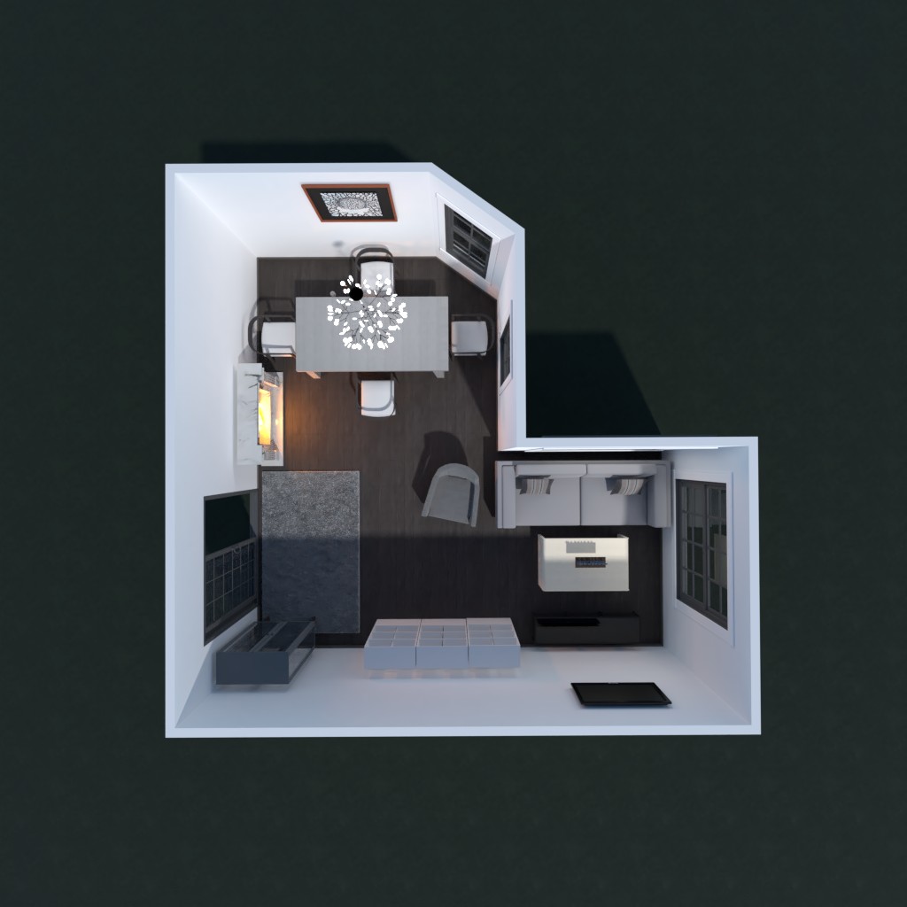
Svetainė ir valgomasis
Suprojektuokite svetainės kambarį su valgomuoju. Interjero stilius - modernus, spalvos - balta, ruda, juoda.

Comments (2)
Hey, DesignChica! I really like your design as a whole. I do like this palette, but I think it would be great if you kind of merged the two, maybe adding some pops of color to this otherwise neutral background. I think this was a great challenge in order to try and get more people to expand their horizons and think of maybe using more blacks and whites in further designs! Besides that, I like the amount of storage space and how you used the space in front of the door, which some people didn't. One thing I would suggest, though, is changing the positioning of the armchair. I like the color and the decision to put it there, but maybe shifting the large white storage bins closer to the shelving right by the door and moving the armchair forward and tilting it more toward the TV a little bit would have used the living room space to further effect. Also, maybe adding more lighting in the form of a floor lamp would be cool too. Anyway, you have my vote and if you could check my project out and hopefully vote for it
2020-12-04 01:25:18Voted
2020-12-04 13:54:00