Comments (14)
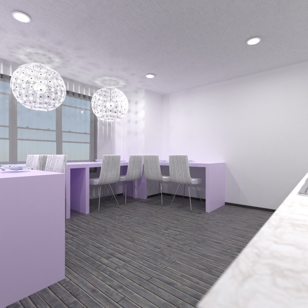
Hey everyone! So, I used the colours purple and green because that is the colour of Internasional woman's day. It is also a spring colour. Of course...this room is awful (every room I do is awful) lol! :)
2021-03-08 01:34:51Anyway, I hope you enjoy! :)))))))))))))
2021-03-08 01:35:19Double chins for the win!!! :))))))))))))))))))))))))))))))))))))))))))))))))))))))))))))))))))))))))))))))))))))))))))))))
2021-03-08 01:35:33To me, that looks more like an office than a dining area. But I really like the unique take on this challenge! Overall, good job!
2021-03-08 04:51:06Happy Internasional woman's day!!! Wow I love your design it is very pretty, although it looks more like an office more that a kitchen/diner, but otherwise I love this design!!! Good Luck!!! also please check out my design!!!
2021-03-08 11:45:04nice job and these colors see mine and rate by clicking on my name
2021-03-08 12:42:03Wow! I didn't know that those were the colors of woman's day. Thanks for checking out mine!
2021-03-08 18:03:45wow, i agree with it looking like an office but i like the purple used so well done. please see mine
2021-03-08 18:52:24I like the theme and what you based it on! Please can you check mine out by clicking on my name:-))
2021-03-08 20:40:24First of all, this room is great but I have a couple of critiques. I agree with Melanie Cyfko but it looks also like a restaurant as well, not really a kitchen for me. I like the white/ gray colors but I think there should be another/more contrasts of gray. The tables and chairs look great but I think accessories on the table would be great to accessories are key. The kitchen area is nice but more color?... Overall I love the design but it's bland, more storage would be nice. More accessories adding more accessories can literally flip a room. Lastly more colors sticking to the same shade of color is not that great it might not pop, adding a pop of color freshens the look. Add an accent wall for contrast. Great Job! Please check out mine, makes sure to comment! Very modern!
2021-03-09 00:54:16Thank you everyone!
2021-03-09 21:56:24You have created an interesting project. It works for me as a dining room where guests come for breakfast, lunch or dinner.
2021-03-10 08:33:23nice room i like such colors
2021-03-13 20:42:58