Commentaires (11)
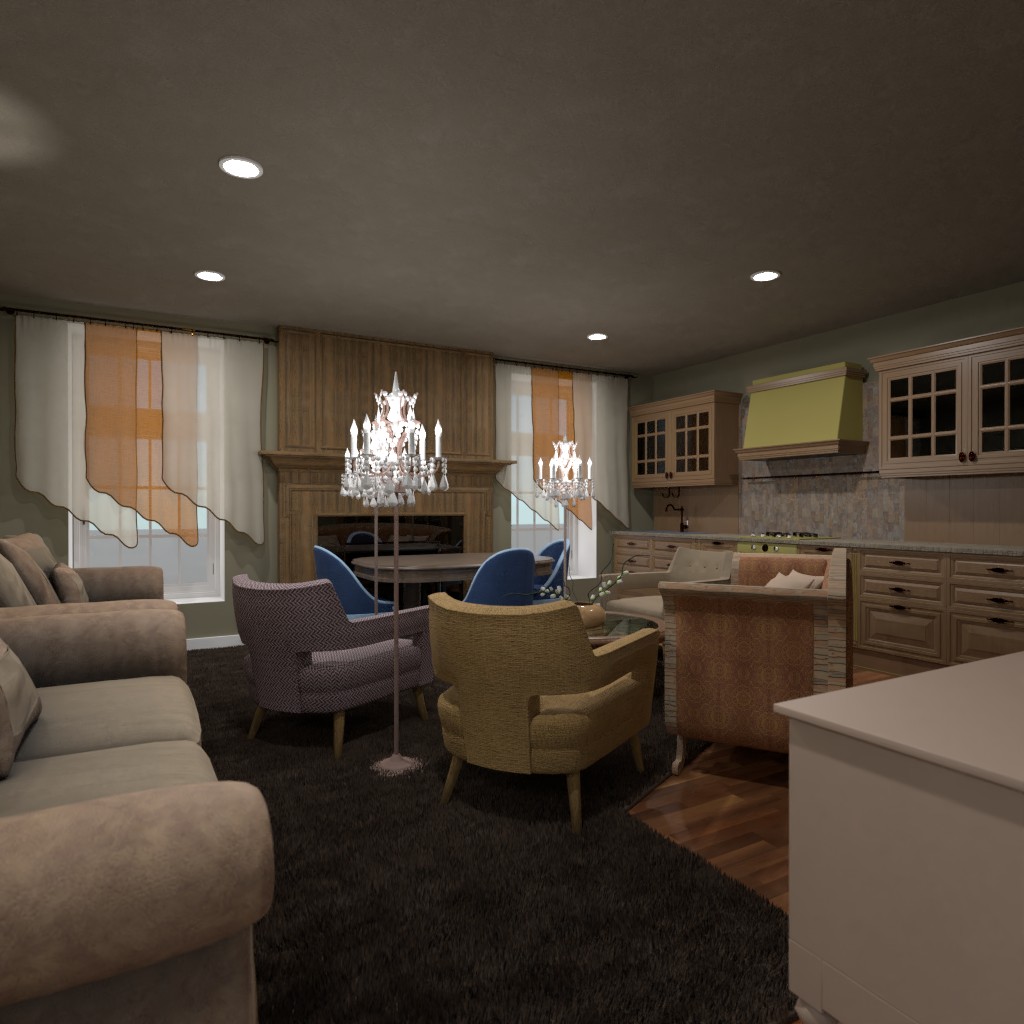
çok kalabalık
2021-02-01 09:50:10I don’t like because the colors are
2021-02-01 13:00:42It is to full, and it is so ugly sorry but that’s the true
2021-02-01 13:04:08It's not very pretty, I'm sorry, but you tried
2021-02-01 14:32:27love the collors of the design. try to not stuf the room to much and don't use the light as filler. The light is an accent you use to focus the vieuwpoint. Mine is on 291if you wanne look
2021-02-02 22:04:19it makes me cringe please less furniture next time
2021-02-03 11:33:46like it. A bit crowded but good. Please check out mine
2021-02-03 21:56:47.
2021-02-04 03:35:53Crowded, and not matching, but can be fixed if the fabric actually matches. And if the furniture is in a logical place. Please check out mine and give me some feedback!
2021-02-04 03:38:03Crowded, and not matching, but can be fixed if the fabric actually matches. And if the furniture is in a logical place. Please check out mine and give me some feedback!
2021-02-05 19:23:51Um why did you Wright the same thing as me
2021-02-07 17:31:17