Commentaires (33)
beautiful I am not a fan of the green tile. but everything else is pretty!
2021-03-01 21:34:02Yes sure I know I wasn't proud either but I tried
2021-03-01 21:34:32Yes I love the green tile I think it goes well with everything, but every one is different
2021-03-01 21:35:23ok
2021-03-01 21:36:14Gostei da combinação de cores. É, essa semana foi difícil mesmo.
2021-03-02 03:07:25It’s nice but like you said it isn’t very pastel. I love the shower area! Please can you check mine out AMV!
2021-03-02 07:27:02Thanks Mia and Mari Mond. I know but pastel is hard to work! Thanks Again
2021-03-02 11:28:44Well my was a over powering blue so it wasn't very pastel either but you could make yours a little neater but well done! my is on page 25 i think
2021-03-02 12:38:35beautiful design, i love the color scheme! i think you did an amazing job, good luck! thanks for your comment!
2021-03-02 13:52:12Thanks!
2021-03-02 14:05:45I like it. It seems a bit empty but good. Not much pastel but nice. Please check out mine. And it has been more then 4 days and my project is not posted
2021-03-02 21:43:26Okay thanks
2021-03-02 21:44:52Hi AMV i love it plzz check mine
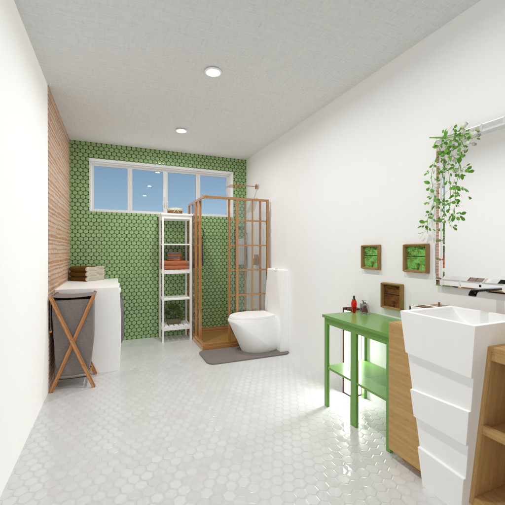
2021-03-03 10:26:42Hi AMV! Thank you for your interest in my comment, I appreciate it. I look forward to seeing your projects in the future. I would start with what I would change a little first. It seems a bit empty to me, despite the fact that a lot of things are placed. But there are too many things at both ends of the bathroom, in the corners. I would have placed the toilet a little further away from the shower and it would no longer look crowded. I would put the sink and shelf on the opposite wall. I would put the washing machines and the laundry rack in the current location of the washing machines. This would make much better use of the space. Let's get to what I like. The color scheme is very good. It uses a very nice shade of green. I would have used the green tile on a larger surface. On the other hand, the wood wall covering is very good, fits the concept. The flowers placed by the mirror, with the green and brown furniture , give a natural atmosphere. The placement, color scheme and pattern of the pictures are perfe
2021-03-03 12:45:27Thanks very nice to take your time to write this description!
2021-03-03 13:24:03Hiiiiiiiiii
2021-03-03 20:40:40Hello!
2021-03-05 00:11:59hi
2021-03-05 00:55:01Hi, I like this color combination , it looks great. I like the type of the tiles as well, and the wooden panel. I would have made all the walls colorful, but is is only my preference. The layout is like they take the render for the vote, but that is okay, so it is a really nice work.
2021-03-05 09:51:19Thanks!!!
2021-03-05 11:25:33Please check out my design!!! Also can we be friends you can call me Char!
2021-03-05 16:49:17Sure Char
2021-03-05 17:31:10hi
2021-03-06 19:06:12