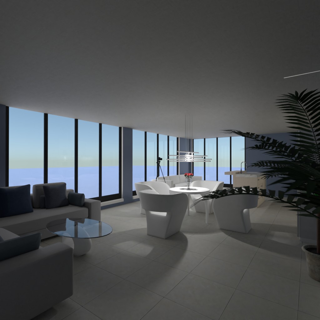
Quarto na cobertura
Desenhe uma cozinha e uma sala na cobertura.

Comentários (11)
It’s nice, it’s a bit hard to see it because of the low ceiling you’ve made! I like the decor and the colours! I just wish you didn’t put the low ceiling as it doesn’t feel ad open but overall i like it! Please comment in mine!
2021-04-05 17:35:58Thank you!
2021-04-05 17:37:30But I do not like the super tall ceilings!
2021-04-05 17:38:01Fair enough! I understand I was just trying to tell you me opinion and what you could do to improve! I do love what you’ve done though!
2021-04-05 17:42:39Thank you!
2021-04-05 17:44:29lovely design! i love the soft blues, the plants by the tv and the marble countertop! it is a refreshing and calm room. well done and good luck. please see mine.
2021-04-06 12:59:18Thank you!
2021-04-06 13:33:33Hi! I like your design! It is nice! I would say the low ceiling is a bit weird but nice. Please see mine by clicking my name!
2021-04-06 14:15:23Ok thank you!
2021-04-06 14:18:15Thanks so much for your comment on mine!! Your colors look great. The walls are a really nice color and the furniture is arranged nicely. But I feel like the high feelings bring the elegant and spacious look to the design and since you changed that it makes it look a little more crowded. But I like how creative you were with making the ceilings low. Also, I would have added a small table where the plants are under the TV but the plants are a nice touch. Overall I think you have a nice design but the low ceilings aren't my style so I won't give you much criticism for it. Nice job this week and good luck!!!!!
2021-04-07 00:51:07Thank you so much!!
2021-04-07 12:01:38