Komentarze (3)
Hello,your design is beautiful i like it I am on the 1 page
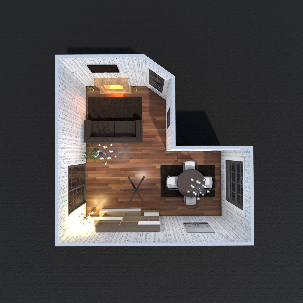
2020-12-03 08:39:45hi joey sanchez! your project is really nice! it’s very modern, and almost a little rustic at the same time, which is very cool. using a lot of brown was a good choice, because it compliments the black and white wall paper. anyway, you also used the space in front of the door with storage that matches but also brings white into the picture more. good job, and i have voted for you, so if you could check out mine and consider giving me a vote, that would be great!
2020-12-04 16:09:39Sorry I missed your comment I will check yours out for this weeks design battle
2020-12-07 14:41:08