Comentarios (19)
it feels very um pushed or well squeezed and it makes me feel uncomfortable sorry but for creativity tops please go look at mine and give feedback
2021-03-01 11:47:18Wow, I love your design, it is very nice, it looks a bit cluttered but it is really lovely otherwise, I love the colors and the decor and the layout, so well done and good luck!!!!!also please check out my design by clicking on my name or going to page 35!!!!!!!!!!!!
2021-03-01 11:50:16copy past comment here above me anyways thanks for the feedback and thanks for understanding
2021-03-01 14:07:23oh and i put in 2 sinks cuz there wasn't other tables to put the accessories on and the lil table idk it looked nice for me ig
2021-03-01 14:10:02um there was never a washing machine in my bathroom so i found it odd
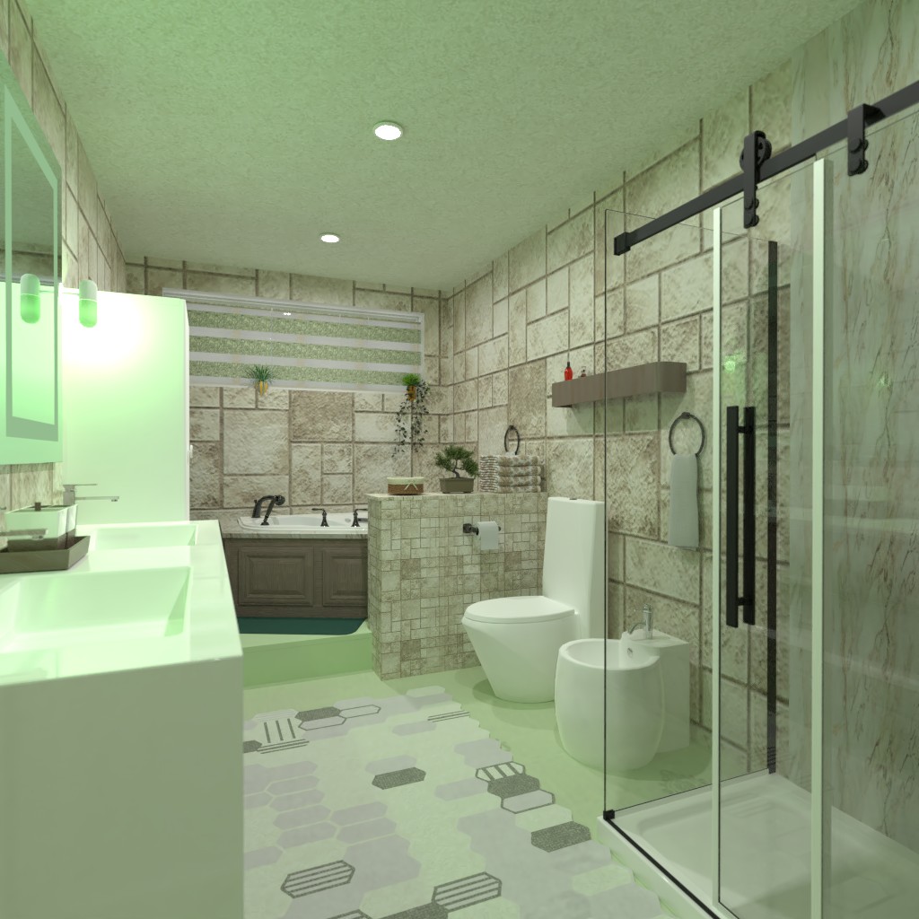
2021-03-01 14:13:22Love the room. The collors work very wel and it works. The bad aria is superb. Love the wall there. The shower would be better if the stone wall came only to the hight of the schower stall. I think it would fit better like that.
2021-03-01 15:50:39Hi Tatjana:)! I loved how your project looked on a 2D thumbnail and it looks even better now when I opened it! I love the idea of having both shower cabin and a nice and comfy bath tub, you even managed to create optical illusion of a water in it, another idea that I like! I also love that little wall/stand you put between the buth tub and the toilet. Color palette is also lovely. Great work :)!
2021-03-01 15:52:32It’s a little crowded, but you picked your colors really well.
2021-03-01 16:34:31Wow Tatjana, me asombra como logro introducir dos zonas de baño y aún así hacer permanecer el espacio abierto y con un buen acceso a todo en la habitación. Muy interesante. Las paredes también son hermosas, fuera de común :) muy lindo trabajo.
2021-03-01 16:36:07Привет Татьяна)..Всегда жду и с интересом рассматриваю ваши работы))) Приятное сочетание салата с бежево-коричневыми тонами... Возьму на заметку) Вот вас 5 человек, которых хочется смотреть и ценить все ваши проекты!!) Всё идеально у вас , удивляет и восхищает ваше творческое мышление! Могу лишь выделить зону ванны с подиумом и перегородкой. Здорово смотрится!!!)
2021-03-01 19:11:44Olga, thank you very much for your comment. I don’t understand everything you wrote because it’s a bad translation, but I think you like my project. I'm sorry I don't understand everything.
2021-03-01 21:04:41Thank you Hall Pat for your comment.
2021-03-01 21:05:11Thank you BooBoo
2021-03-01 21:05:31HI
2021-03-02 12:27:00i think the space is too crowded and i dont like the walls but the green is very pretty. pls see mine
2021-03-03 17:47:16I really like it, but i feel the space is to crowded. I like the green and the ledge with the beautiful bath tub placement. Although there is a few pointers. You probably noticed this one, but why is there a wall just sticking out? I feel like a lot of things are overlapping. I'm on page 7
2021-03-04 20:39:04