Comentarios (6)
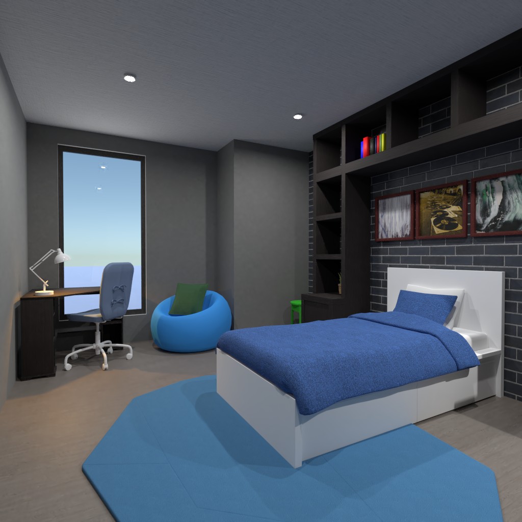
Hi! I think if you're going to add a brick wall, your better off keeping your other walls white, no offense.... I don't think the colors match that well. The blue and the green are somewhat of an eyesore, considering the color of the walls. I don't like the brick outside of the room. I do like the desk and accent wall! The shelving unit over the bed with the paintings is so nice! For me, some things I do like somethings I don't like. Good Luck!
2021-02-26 15:15:29I agree with Ellie;), the other wall has nothing on it so maybe putting more accessories or equipment, would be great. I think it needs more color. gray and blue are great, but it's supposed to be a fun room. I think adding some yellow or orange would have been great. When you put the egg chair behind the desk, you should have put it on the blank wall, to utilize space. The bed area looks great, but it's missing something. Great formatting! I love how the bed area is very fun and compares/contrasts well. So cohesive, Great job! Please check out mine, make sure to comment!
2021-02-26 15:51:58Me gusta el gris de las paredes le da un toque serio y maduro, pero a su vez el color azul lo hace brillante y muy vibrante, interesante combinación. La pared de acento en ladrillo es increíble, va muy a juego con el resto de la habitación :)
2021-02-26 16:26:34muchas gracias!
2021-02-26 17:12:19Thanks, T;) and Ellie! I always appreciate feedback!
2021-02-26 17:40:58AMAZING design! i love the color scheme, you did an excellent job! i love how spacious the room is, and good luck i hope you win! btw thank you for your sweet comment!
2021-02-26 22:43:24