Kommentar (17)
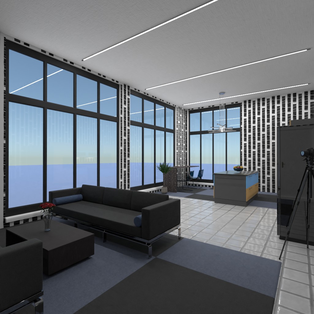
Hi! Sooooo... I don’t like this. The color neon blue that u used is not appealing the wallpaper makes it look like a kids room. And, it’s very dark. This is not fit the theme. Nice effort. Please check out mine and give me some feedback about it thanks
2021-04-05 01:14:59@Its_the_OG_designer_! I agree and good job to Isabella Albert!
2021-04-05 01:19:50the theme is pennthouse itis modern
2021-04-05 19:45:40I like it though, but the color in the kitchen does not match with blue and black. But all the effort is good. :)
2021-04-06 00:55:17ok thank you I will vote,for you
2021-04-06 03:59:29I like it Isabella!
2021-04-06 16:57:18thank you so much
2021-04-07 12:26:22thanks but the theme is modern
2021-04-07 14:38:31i dont think you understand
2021-04-07 14:53:55I understand bud
2021-04-07 16:06:58Nooooo
2021-04-07 20:27:33The theme might be modern but that wallpaper dodges the go well at all!
2021-04-08 07:15:54it is fine you guys are just picky i like it so buzz off
2021-04-08 12:22:28Huh?
2021-04-09 23:05:38We are Giving you our opinion. And in no way are we trying to offend you. I want you to look up penthouse design and go into images. Every single one is lightly colored. I just wanted to let you know. Have a good night Isabella Albert
2021-04-09 23:06:33i looked it up they all are not litley olred
2021-04-11 17:03:06