Komentarze (3)
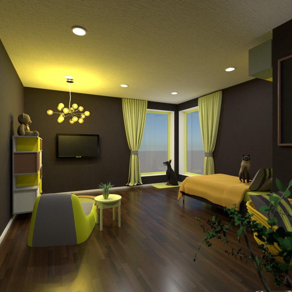
It is clear that you have put much thought and time into the process. I do have a few remarks, however. Though it was one of the criteria, I find that neon yellow and grey don't exactly go well together; a softer yellow would have been much better here (especially considering that this is supposed to be a room for children, if it was targeted for teens, it would have probably worked better). There is also the fact that the room is awkward in some areas: the shelves on top of the bed are unattaina0ble and the alarm clock should be near the bed rather than on the desk, not to mention that there is no closet space for clothes (which I know was not one of the criteria, but is rare for a children's room not to have). That being said, I really love the design and I am sure you will get even better regarding room usability with practice.
2021-01-12 14:15:41Thanks so much for the feedback! :)
2021-01-12 19:11:45Hello! I hope yall are considering voting for me!
2021-01-14 20:22:01

